Designing a starship interface taught me more about UI than any course
A web designer on what years of drawing sci-fi computer screens taught him about hierarchy, colour and constraint, and how it shows up in the client websites he builds.
2 min readMichael Overton
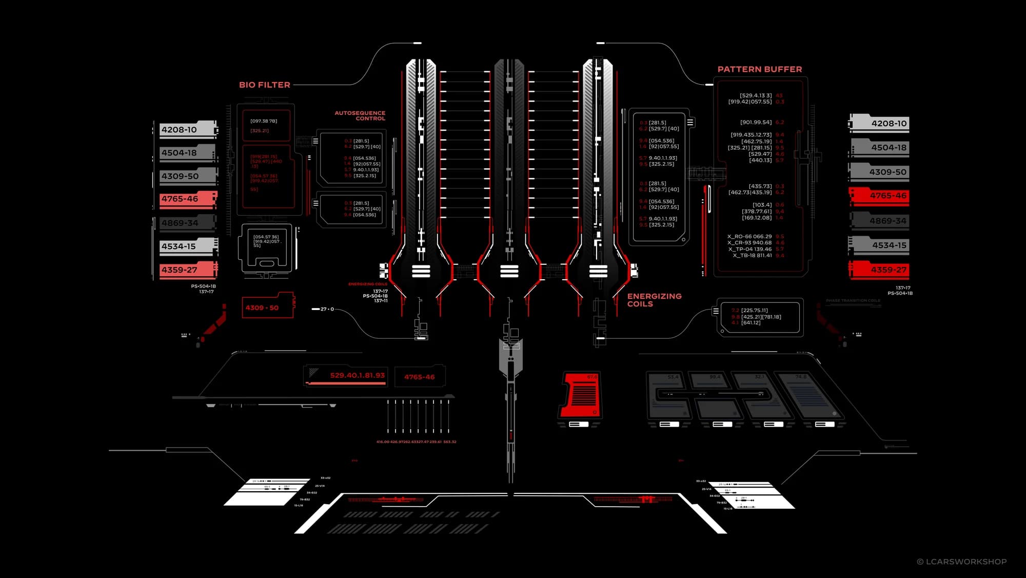
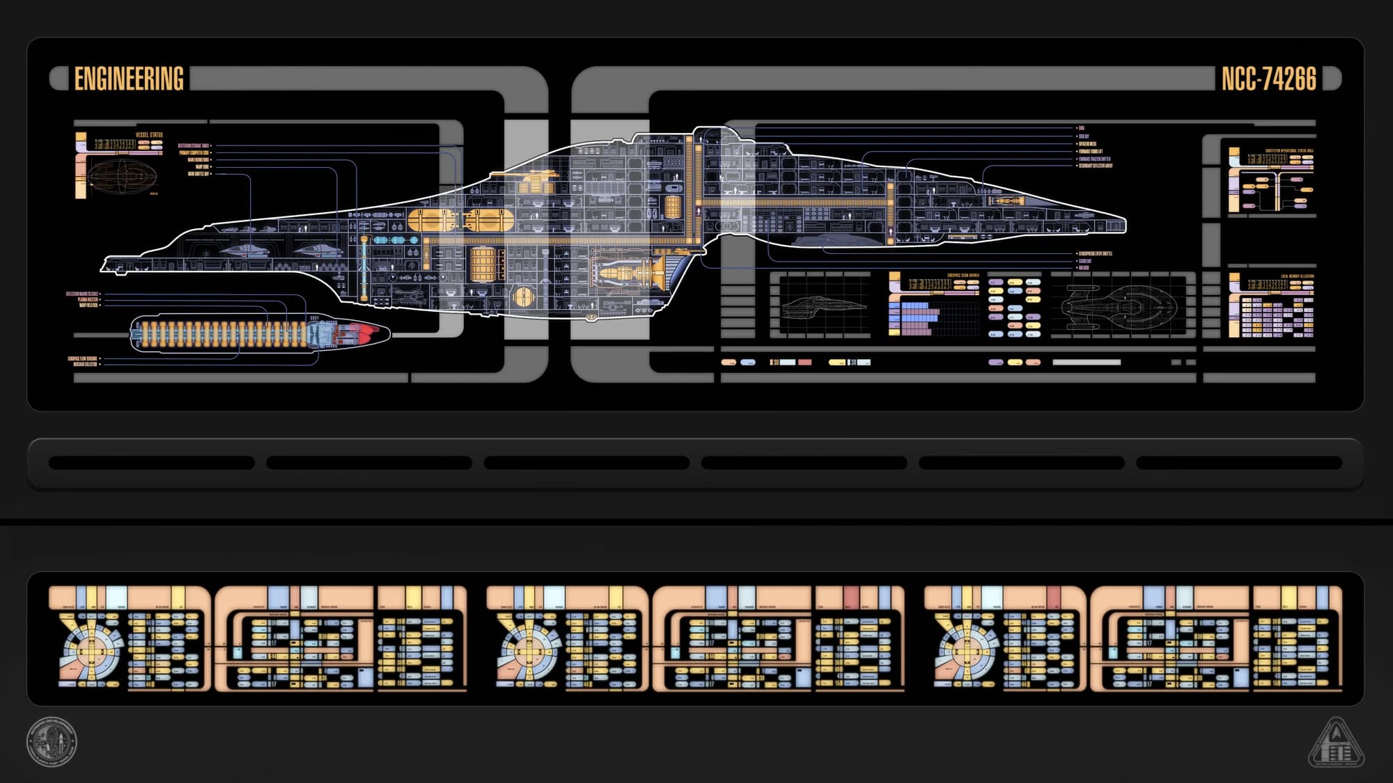
In my spare hours I draw computer screens for a starship that doesn't exist. I've been doing it for years. There's a new wallpaper every week, free, and a surprising number of people put them on their actual monitors.
It started as a hobby. It's turned out to be the best design education I've had.
Constraint makes you good
The interface language I work in has strict rules. A fixed palette. One typeface. Rounded elbows that frame every panel. Blocks of colour with small labels. Almost no icons, because the original designers in the eighties couldn't render them.
Within those rules you have to make a screen that reads instantly as "transporter control" or "warp core status" to someone glancing at it on television. You can't add a drop shadow to save yourself. You can't use a second font. You have to make hierarchy with size, position and colour alone.
Do that a few hundred times and you stop reaching for decoration on client work too. If the layout doesn't communicate without the shadows and gradients, the layout is wrong.
Colour as meaning, not mood
On a console, colour tells you what something is. This hue is navigation, that one is engineering, the red one needs attention. Colour is information before it's atmosphere.
Most websites do the opposite. Colour is applied for feel, and meaning is left to the text. When I design a site now I pick one accent and give it a job. On my own site, yellow means "this is the thing to do or notice". Nothing else gets to be yellow. People don't consciously see the rule, but they feel the clarity.
Density is a choice
A starship console is dense. Dozens of readouts on one screen. It works because everything is aligned to a grid and grouped by function, so your eye can skip what it doesn't need. The lesson isn't "make websites dense". It's that density isn't the enemy, disorder is. A sparse page with no grid is harder to read than a full one with a good one.
Motion should mean something
The screens blink and scroll because they're showing data changing. Nothing moves for the sake of it. I try to hold websites to that. If a thing animates, it should be telling you something: that a message arrived, that a page loaded, that your action worked. Animation as garnish is just slower.
Why I'm telling you this
Because when people hire a web designer, they're hiring their eye, and an eye is trained by what it practises on. Mine has spent years inside a system with no room to hide. It makes me pickier about alignment, firmer about colour, and more willing to take things away.
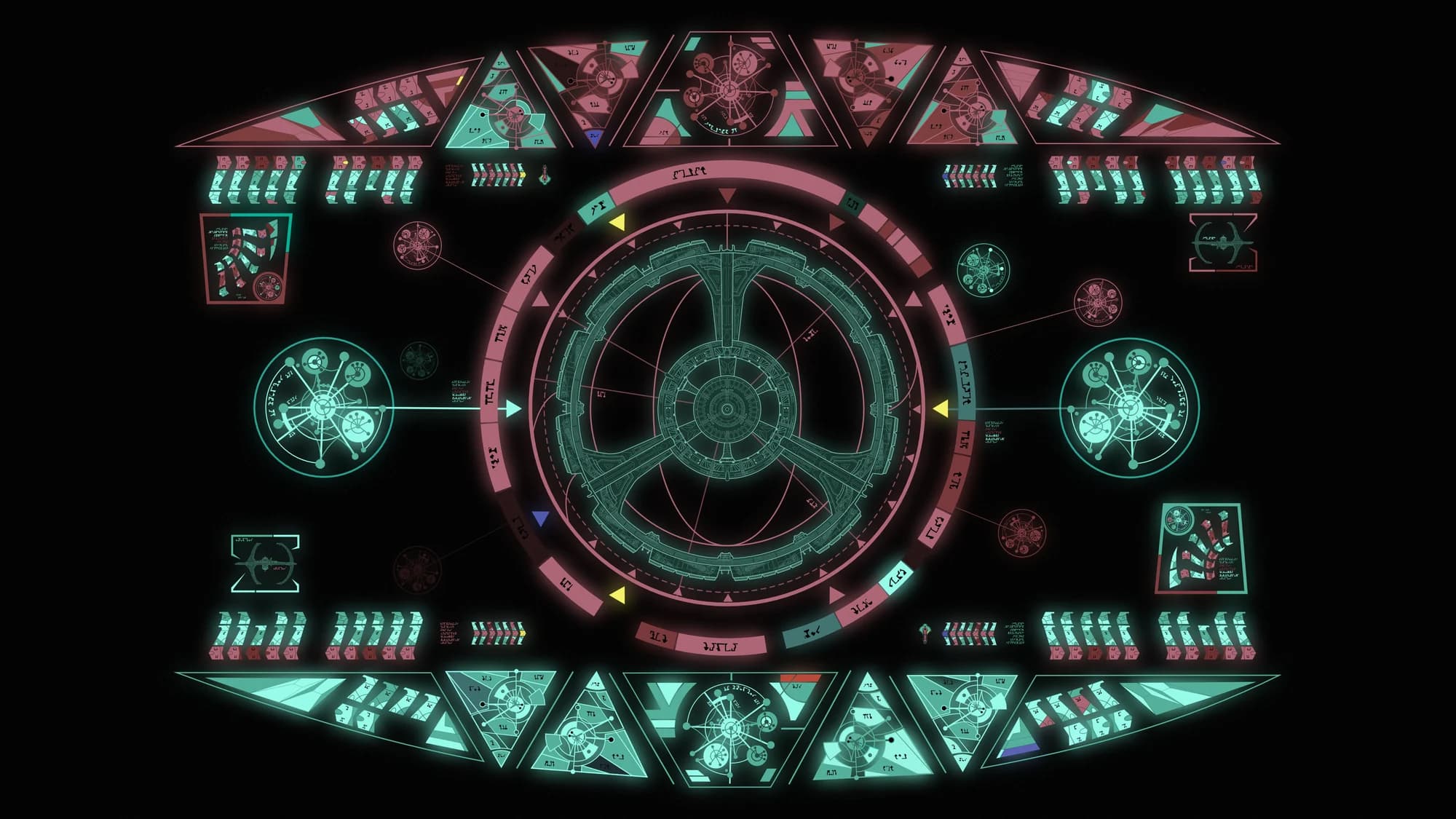
The wallpapers are free if you want one. The websites aren't, but they come with the same eye.