What I learned building a brand from scratch for a podcast
Designing the identity for the Clonestar Podcast, from the logo and cover art to Patreon tiers and platform icons. Practical lessons for anyone branding a podcast.
2 min readMichael Overton
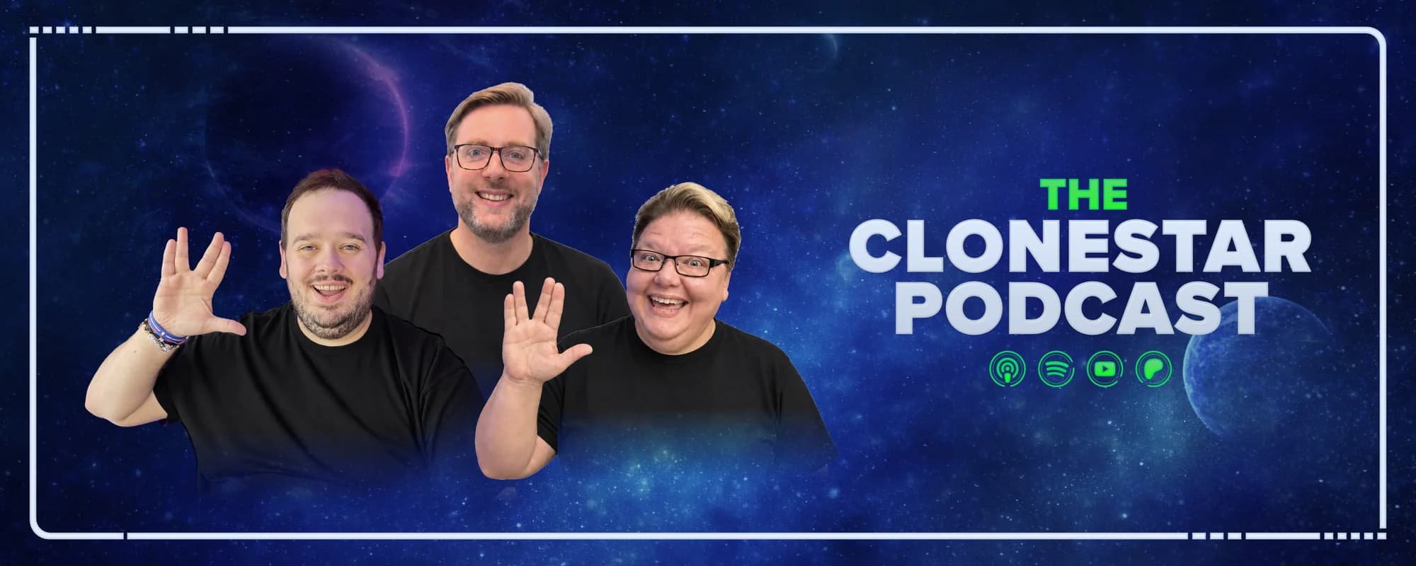
I co-host the Clonestar Podcast. I'm also the person who designed every pixel of it, which means I got to make all the mistakes before anyone else saw them. Here's what stuck.
The thumbnail is the brand
Everything you design for a podcast will be seen, most of the time, at the size of a postage stamp. The cover art on a phone. The channel icon in a sidebar. The Patreon tier badge next to a username.
So the first rule: design small first. The Clonestar mark is a delta inside an orbit ring that never quite closes. It reads at sixteen pixels. The wordmark is secondary, because at sixteen pixels there's no room for words. If your logo needs a tagline to make sense, it won't survive the feed.
One idea, many jobs
A podcast brand has to show up in more places than most businesses: cover art, video thumbnails, a website, social templates, convention banners, merch, membership tiers, platform icons. Different shapes, different sizes, different materials.
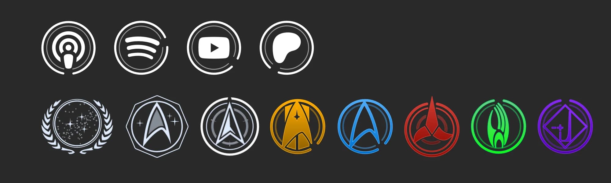
What holds it together is one visual idea applied everywhere, not one logo pasted everywhere. For Clonestar, that's the broken ring. The platform icons use it. The faction emblems use it. The Patreon tiers, named after quadrants of the galaxy, each have their own colour and emblem, and every one is a ring. You recognise the family before you read the name.
Colour does the heavy lifting
Episode thumbnails need to be made weekly, quickly, by whoever's editing that week. A rigid template gets boring and a free for all gets messy. The answer was a small palette with rules: this colour for reviews, this for interviews, this for news. The system makes the decision, so the person doesn't have to, and the feed still looks like one show. Those rules live in a guidelines site, not a PDF, so whoever's editing can find them.
Build the website like the brand is the product
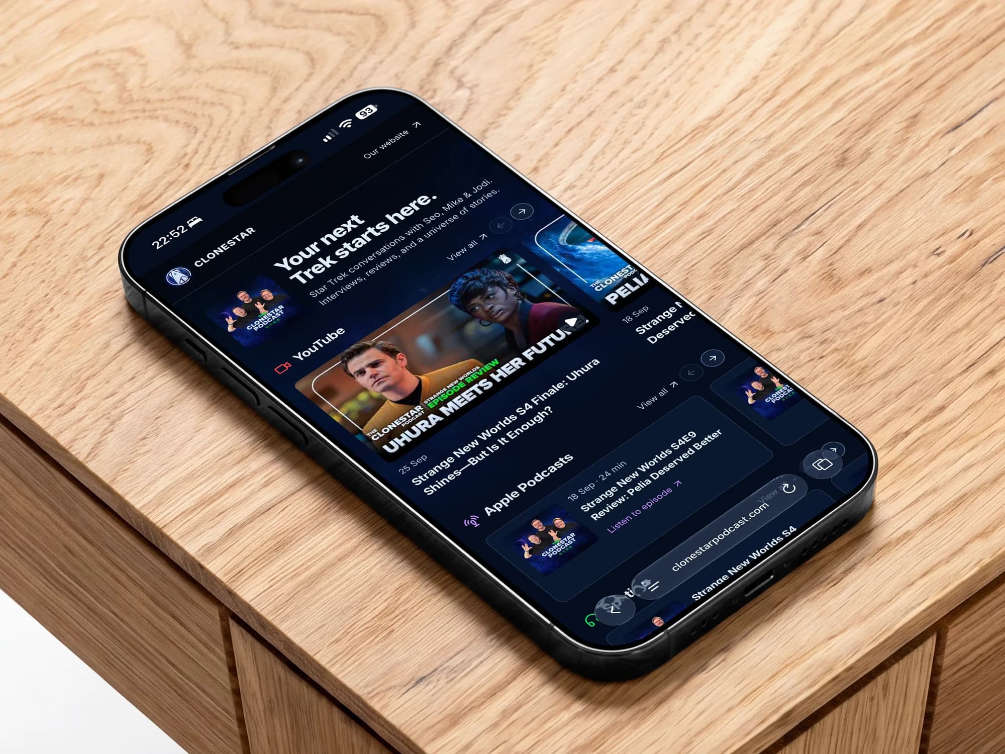
The podcast site is where the brand lives at full size. It's also where guests get booked, episodes get found and the Patreon gets explained. We built a proper guest booking flow into it, with confirmations and calendar invites, because a podcast brand that's professional on Instagram and chaotic by email isn't really a brand.
What this means if you're starting one
Spend the money on the mark, not the wordmark. Design at thumbnail size. Decide your colour rules before episode one. And get the cover art right before you record anything, because you'll be looking at it for years.
If you want a hand with any of that, I've done it once for a show I care about and I'd enjoy doing it for yours.