JustElectrix
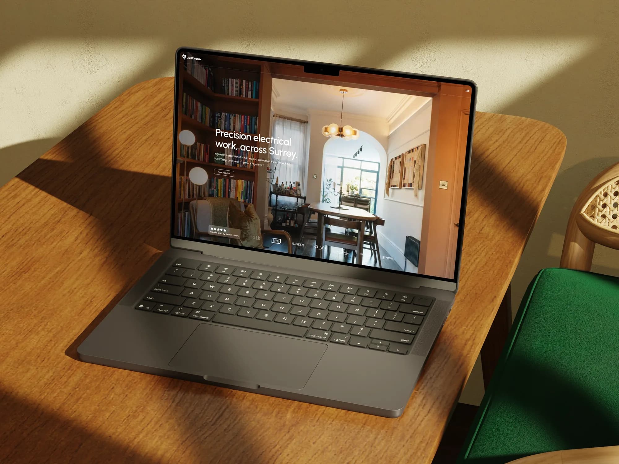
A premium website and full brand identity for an electrical contractor whose work has been on Grand Designs.
- Location
- Woking, Surrey
- Sector
- Electrical
- Year
- 2026
- Services
- UI/UX, Design, Development, SEO, Branding
The client.
JustElectrix is an electrical, renewables and security contractor based in Woking. For over twenty years they’ve worked for homeowners, developers and interior designers across Surrey, north Hampshire and east Berkshire, on full rewires, bespoke lighting, integrated security and solar.
They’re NAPIT approved and TrustMark registered, and their work has appeared on Grand Designs.
There was a gap between the standard of their work and how they looked online. Their customers aren’t after the cheapest trade: they’re homeowners mid renovation, architects specifying contractors, developers who need the electrics delivered to programme. They needed a site that sat alongside the work instead of undercutting it, and a brand their team could hold to without a designer in the room.
What I built.
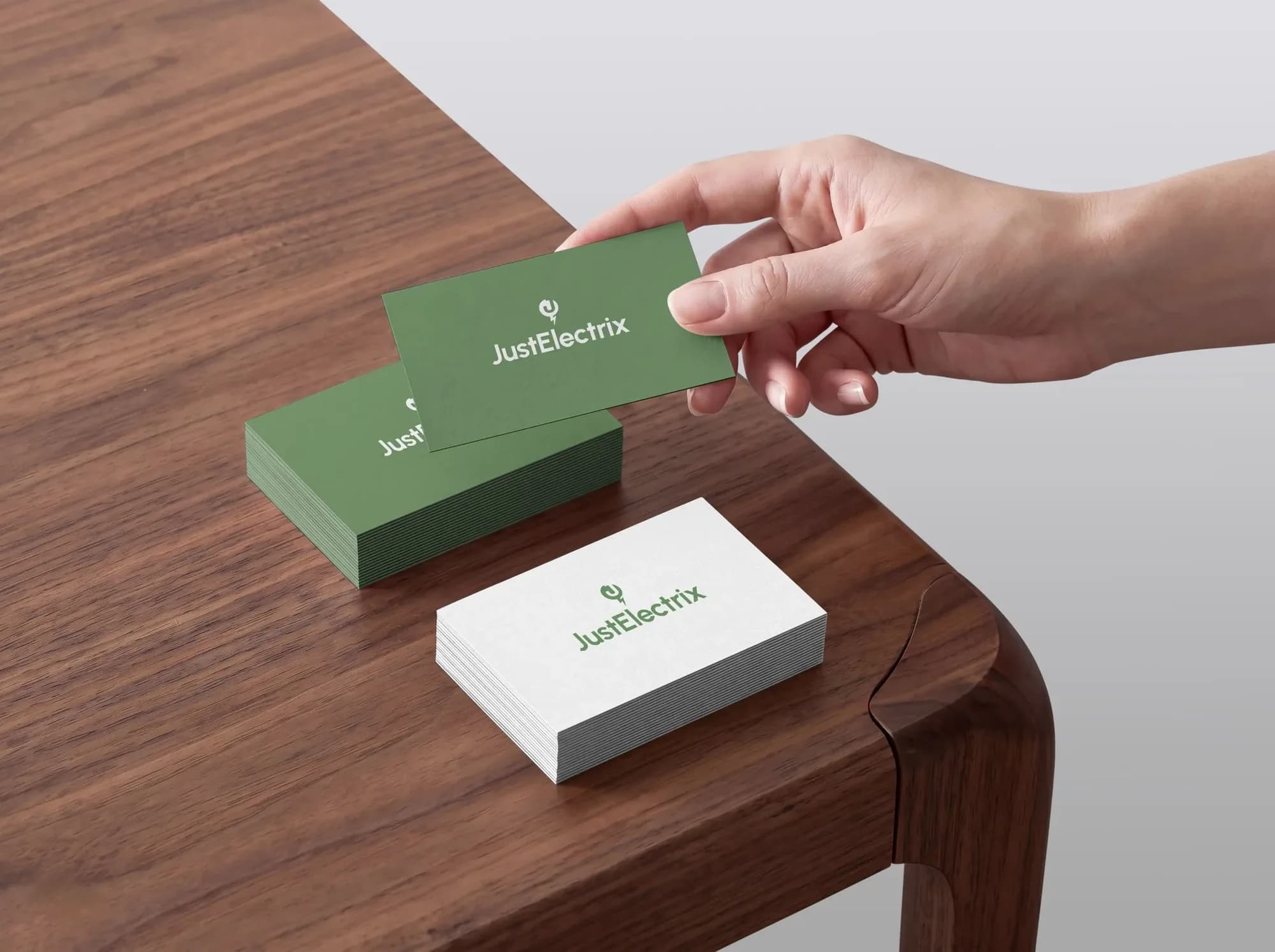
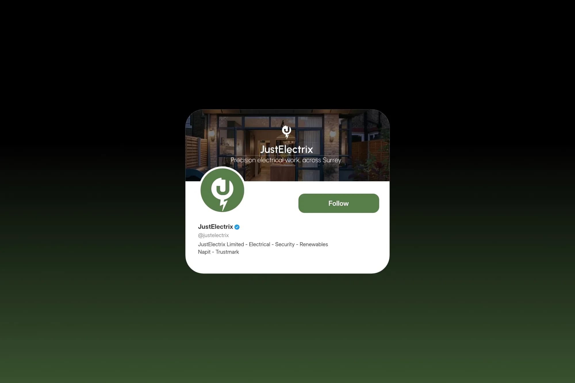
They came to me with a single icon and nothing around it. I kept the icon, a J built into a plug and earthed by a bolt, and built a full identity from it: a wordmark in Urbanist, three lockups, four colourways, a colour palette, a type system and clear space rules, all pulled into a brand guide.
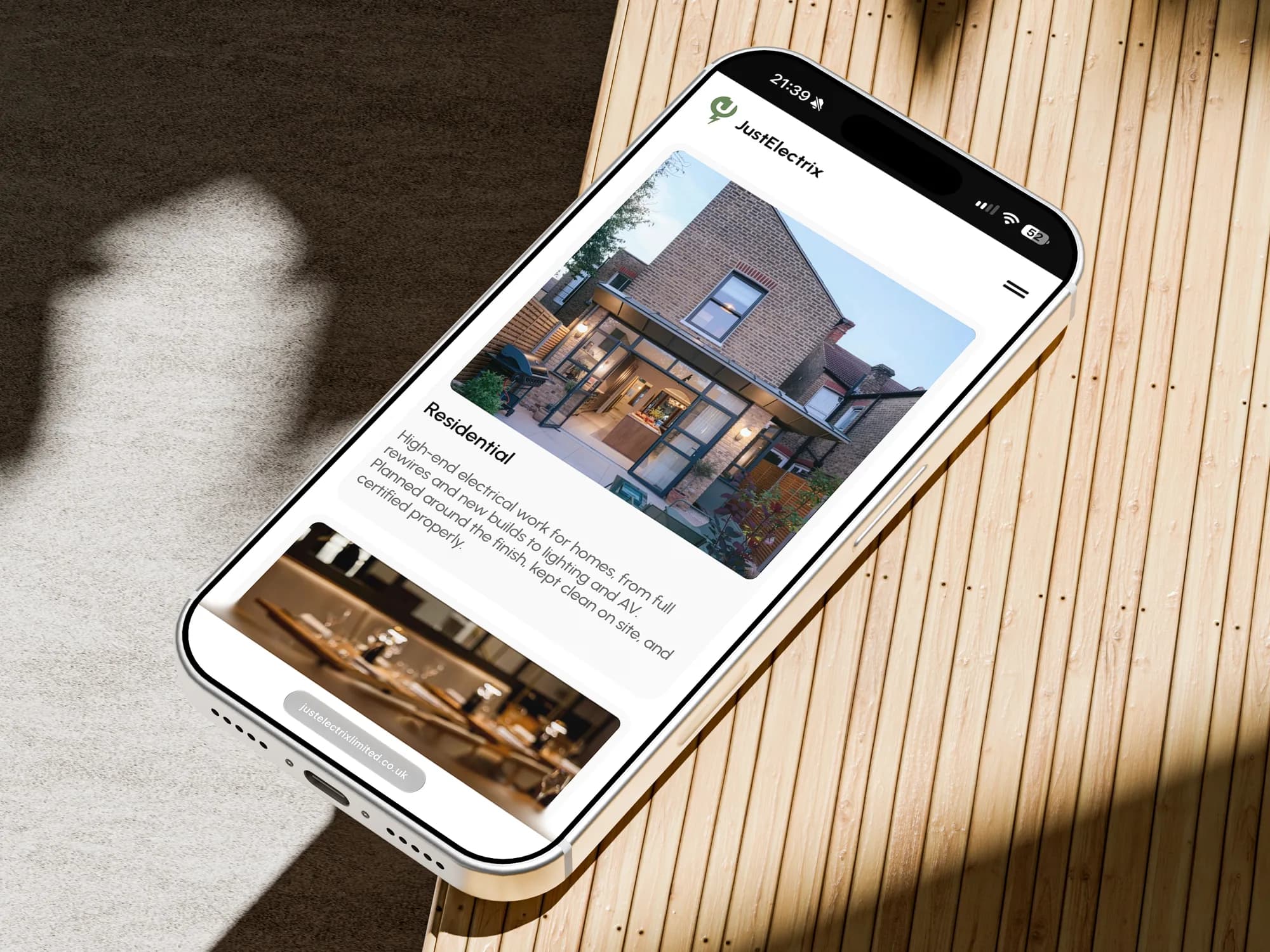
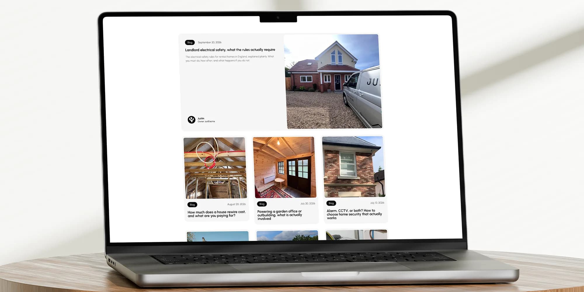
From there, a 26 page website on WordPress and Elementor. Four service pages, a hub and spoke structure for the towns they cover, a blog, a case study template and all the legal and utility pages. The design is deliberately restrained: near black type on white, one typeface, real photography of their own finished work, and the brand green used as an accent rather than a wash.
The location pages come from one master template, turned into each town by script, so a new area takes minutes rather than hours. Every page ships with its keyword, metadata and schema in place, and the blog is loaded with a year of posts that publish one a month on their own.
The brand at work.
The detail.
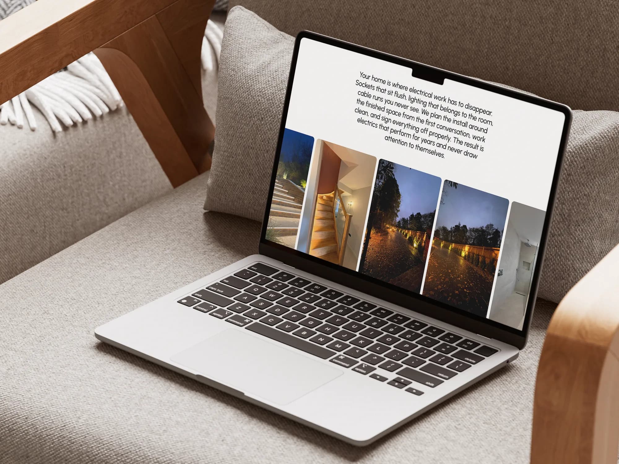
I wrote the full site copy, produced the brand guide as a print ready PDF, designed the email signatures with an install guide for Apple Mail and Outlook, built a branded enquiry email, and drafted the privacy policy and data processing agreement.
Along the way the brand green was darkened to a shade that passes accessibility contrast on white, and the old value retired so it can’t creep back.
It runs on my managed stack with Nginx, BunnyCDN for delivery, cookieless analytics so there’s no consent banner, and Rank Math Pro for SEO.
JustElectrix went from an icon and no system to a brand that holds together across the site, the signatures, the emails and everything built next. The website finally reads like the studios and architects they work alongside, their team can extend it without touching code, and the blog keeps publishing for a year without anyone lifting a finger.
- Pages designed and built
- 26
- Months of posts scheduled
- 12
- Icon turned into a full brand
- 1