A.T.L.A.S
When NASA sent people back towards the Moon, I built my own mission control to follow them.
- Online at
- track-artemis.com
- Sector
- Side project
- Year
- April 2026
- Services
- Design, Development, Data
The idea.
When NASA launched Artemis II on 1 April 2026, the first crewed mission to the Moon since 1972, I wanted to track it properly. Not a simplified countdown page. Not a social media embed with a progress bar. A full mission control dashboard. So I built one.
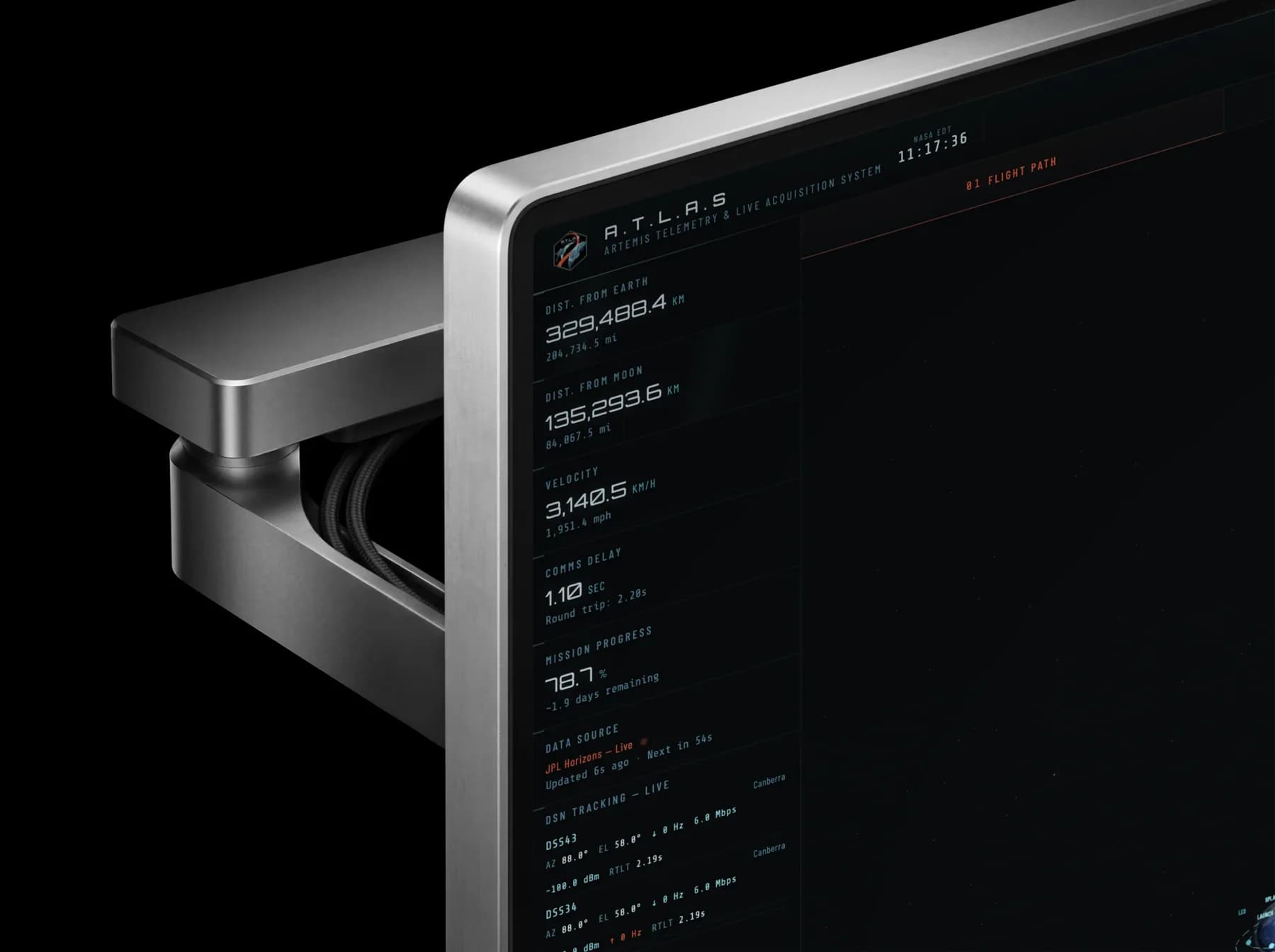
A.T.L.A.S is a single page web app that tracked the Artemis II mission in real time, pulling live data from NASA’s JPL Horizons ephemeris system, the Deep Space Network and the AROW spacecraft telemetry feed. It’s hosted at track-artemis.com and went live on launch day.
Getting the 3D trajectory right was the hardest part of the build. Near the Moon, tiny timing changes sent Orion hours ahead of itself, and the real flyby is a tight teardrop, not the wide horseshoe most diagrams show.
What it does.
The dashboard presents live mission data across multiple panels, designed to give you the same situational awareness mission controllers have. Just with a better colour scheme.
- Live orbital telemetry
- Distance from Earth and Moon, spacecraft velocity, mission elapsed time and mission progress, all computed from JPL Horizons ephemeris data for spacecraft -1024 (Orion) and updated every 60 seconds.
- Interactive 3D trajectory viewer
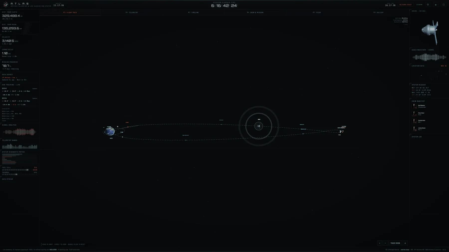
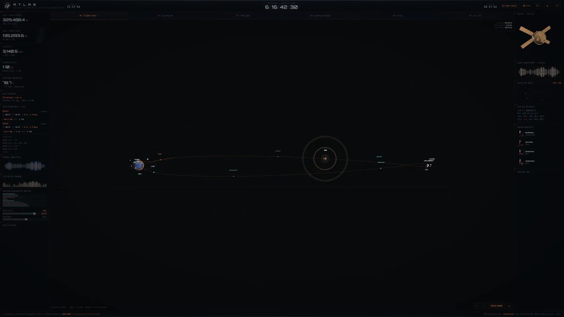
- A full Three.js scene of the Earth and Moon, with Orion animated along the actual free return trajectory: parking orbits, burns, the lunar flyby and the return, with interactive controls and waypoint markers.
- Spacecraft telemetry
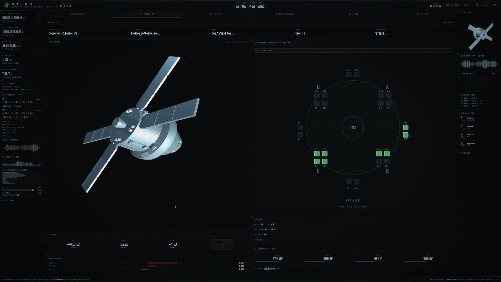
- Live attitude data (roll, pitch and yaw) with an artificial horizon, angular rates with bidirectional bars, solar array wing angles with estimated power output, and an RCS schematic showing all 24 thrusters firing in real time. All sourced from NASA’s AROW community API.
- 3D Orion model
- A decimated 1,200 triangle mesh of the Orion spacecraft, driven by live quaternion data from AROW telemetry, sitting in a starfield with cinematic lighting.
- Deep Space Network tracking
- Live dish status from NASA’s DSN Now feed, showing which ground stations in Goldstone, Canberra and Madrid are tracking Orion, with signal direction, frequency bands and data rates.
- Crew and mission panel
- Crew bios in a two by two grid, a 29 event milestone timeline, mission records and spacecraft parameters.
- NASA image gallery
- Live imagery from the mission, pulled from NASA’s gallery pages and shown in a lightbox viewer.
- Splashdown countdown
- A cinematic countdown overlay with live phase tracking, from return coast through service module separation, atmospheric entry and chute deploy to splashdown, which minimises to a floating widget.
- Simulated telemetry fallback
- When NASA’s AROW feed goes down, the dashboard automatically generates physically plausible telemetry based on the current mission phase, so it never goes dark.
Inside the dashboard.
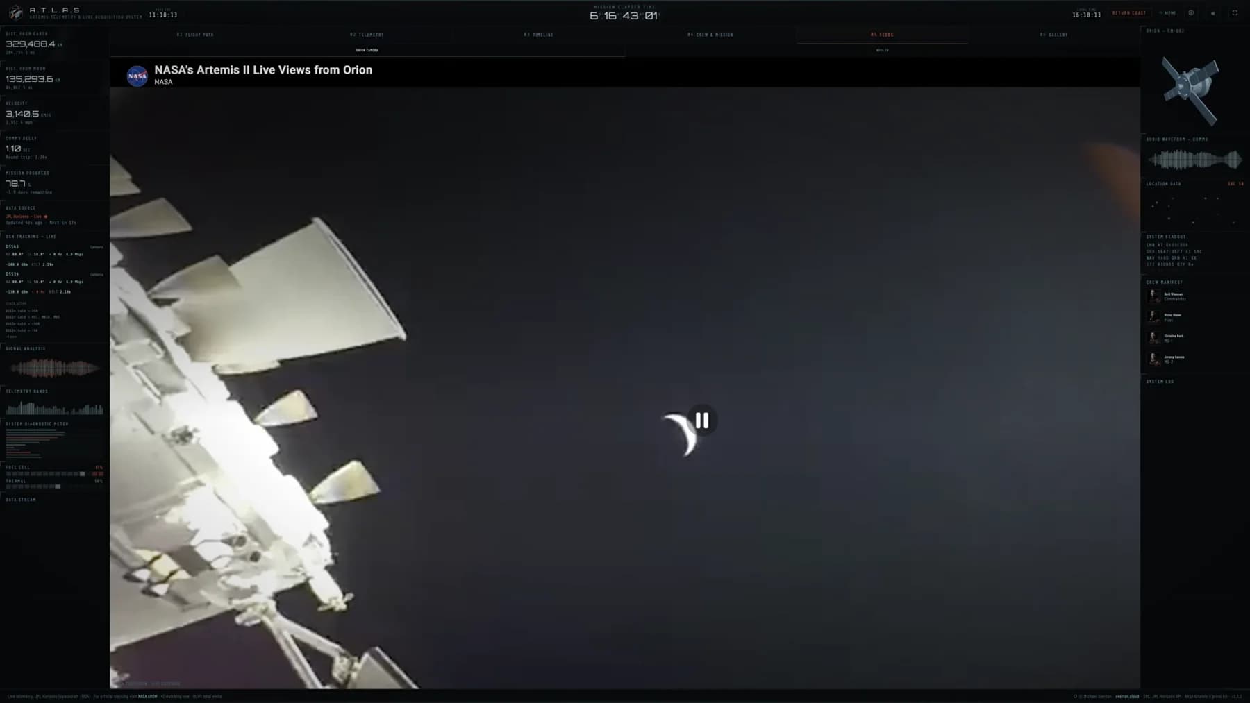
The trajectory problem.
The path uses Bézier curves with around 347 control points, and there’s a critical catch: the curve is extremely dense near the Moon. Small changes in the interpolation produce huge jumps in position there. Without careful intermediate waypoints in the timing map, Orion would appear to teleport to the Moon hours before it should arrive.
The outbound and return legs are also much closer together than you’d expect, only 8 to 14 units apart on a 90.5 unit Earth to Moon scale, so the separation is subtle rather than the wide arcs most diagrams suggest. The flyby itself is a tight, pointed teardrop past the far side of the Moon, not the horseshoe shape in simplified mission graphics.
Getting that shape right meant constant reference back to NASA’s own flight map. And the whole path had to sit in the XZ plane, not XY. Put it in XY and it appears rotated on its side in the Three.js scene.
How it’s built.
The entire app is one HTML file and one JavaScript file. No frameworks, no build tools, and no dependencies beyond Three.js loaded from a CDN. Everything else is vanilla JavaScript, CSS custom properties and hand written SVG.
- Front end
- HTML, CSS and vanilla JavaScript, with Three.js for the trajectory viewer and attitude model. CSS custom properties power a full theme system with three colour schemes: Default (cyan), Ares (navy and orange, Tron inspired) and Gold (black and gold). Type is Orbitron, Share Tech Mono and Barlow Condensed.
- Back end
- PHP proxies handle CORS for NASA’s data feeds. A single API endpoint with time based token authentication serves everything in one request, with independent server side caching for each source.
- Data sources
- The JPL Horizons API for Orion’s ephemeris, NASA’s AROW community API for attitude and systems telemetry (streamed, with a polling fallback), the DSN Now XML feed for Deep Space Network status, and NASA’s image galleries.
- Design
- Cinematic sci-fi interface design, the Oblivion and GMUNK look, crossed with the Artemis II mission patch palette. The mission badge, the Orion illustration and every UI element were designed in Affinity Designer.
Design details.
- Orion illustration
- 170 individual SVG paths, each reshaded with position based colour mapping and upper left lighting to match the Artemis II patch palette.
- A.T.L.A.S mission badge
- A custom badge designed for the project, used on the loading screen, in the header, in the about panel and as the favicon.
- Theme system
- Three complete colour schemes built entirely on CSS custom properties. Switching themes changes everything: the 3D scenes, the telemetry panels, the trajectory colours, the Earth’s atmosphere glow, even the thruster indicators.
- Data stream animation
- A scrolling hex data feed runs continuously in the sidebar. The trick to keeping it contained was animating an inner wrapper rather than the container itself.
- Responsive
- A full desktop layout with sidebars either side of the central view, which collapse on smaller screens.
What I used.
- HTML, CSS and vanilla JavaScript
- Three.js for 3D rendering
- PHP for API proxies and data caching
- Affinity Designer for the illustration, badge and UI
- JPL Horizons, NASA AROW, DSN Now and DONKI APIs
- CSS custom properties for the theme system
- Cookieless visitor tracking
Why it matters.
This project sits where a few things I care about meet: design, data, and building things that feel alive. It’s a single page app with no framework, pulling from five NASA APIs, rendering two separate Three.js scenes, running a complete theme system and handling graceful fallbacks when data sources fail, all in vanilla JavaScript.
It’s also something I built because I genuinely wanted to use it. Every design decision came from watching the dashboard during the mission and thinking, that bit needs to be better. That’s the kind of work I do best.
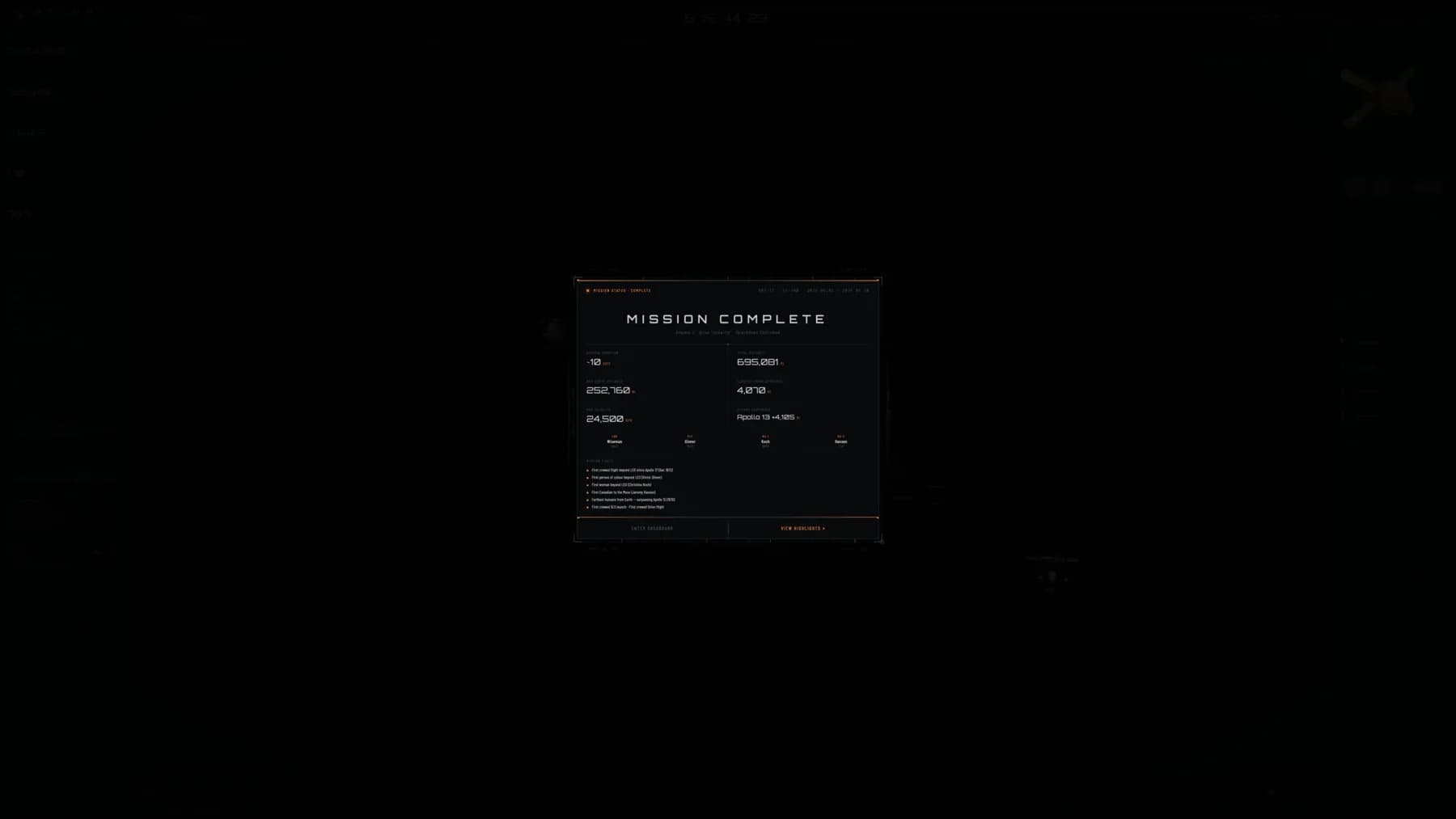
Over the ten day mission, A.T.L.A.S tracked every phase from launch to splashdown, with live telemetry throughout. Since launch it has been used by 21,013 people across several continents, and since splashdown it runs in replay mode with the archived mission data.
- Users since launch
- 21,013
- Days, 1 to 10 April 2026
- ~10
- Miles travelled in total
- 695,081
- Miles from Earth at the furthest, beating Apollo 13 by 4,105
- 252,760
- Miles at closest lunar approach
- 4,070
- mph peak velocity
- ~24,500